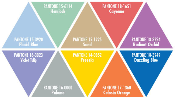
Every year Pantone, the global authority on color, surveys the designers of New York Fashion Week and more to bring you the season’s most prominent color trends. This year’s Pantone forecast has everything you need.

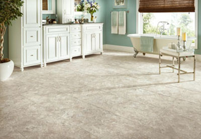
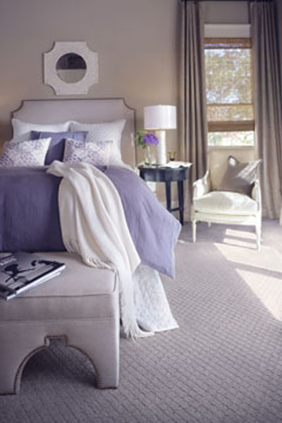
The Placid Blue, Hemlock green and Violet Tulip are very versatile pastels that can be paired with almost any other color in the spectrum. These three colors are often found in nature — the tranquil sky blue, the romantic floral purple, and the ornamental green of springtime foliage — which makes them easy to see with bolder hues for a modern palette.
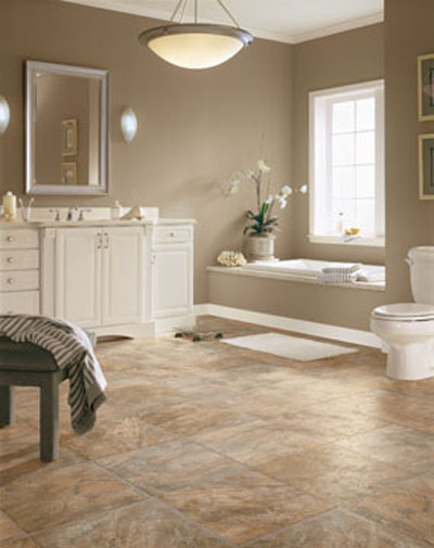
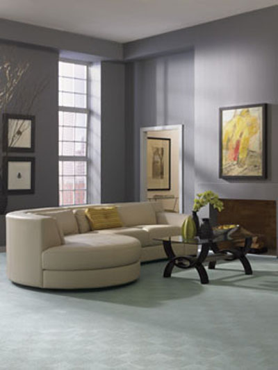
The token neutral this year is the warm and toasty Sand which pairs beautifully with a cool green Hemlock and even the warm gray tones of Paloma for an enticing neutral atmosphere.
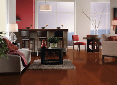
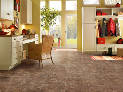
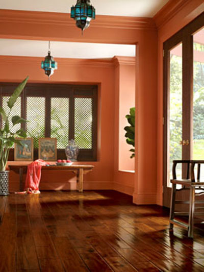
The bold Cayenne red paired with the blazing Freesia created a excitement and illumination that will be very popular in wardrobes this season. Celosia orange is the natural third to the warm hue family this year, but also fits swimmingly with the Violet Tulip conjuring images of a setting sun.

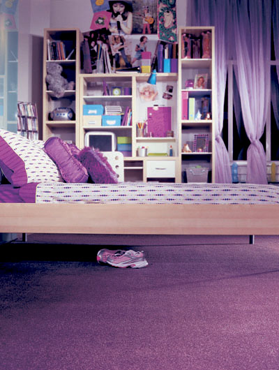
We finish this year’s pallet up with Placid Blue’s polar opposite Dazzling Blue and 2014’s Pantone Color of the Year: Radiant Orchid — Violet Tulip’s bolder counterpart. Both of these vibrant hues pair well across the board, adding confidence to other bold colors and complimenting pastels perfectly.



 Prelude Version 2.1